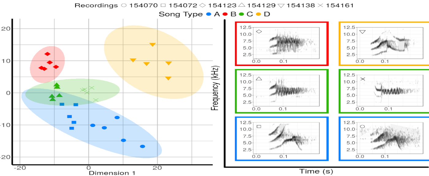
Someone asked me for the code to make figure 3 in the Methods in Ecology and Evolution paper describing warbleR. So, here it is. The figure was made in part by my collaborator Grace Smith-Vidaurre, so thanks to Grace for sharing.
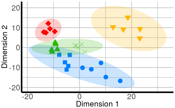
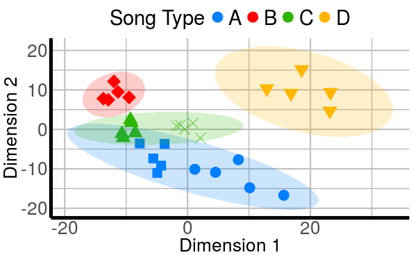
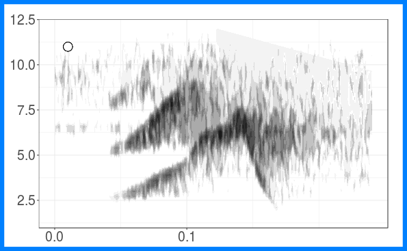
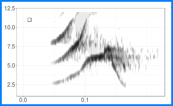
The figure shows the grouping of long-billed hermit songs in the acoustic space based on similarity of dominant frequency contours. Similarity was assessed using dynamic time warping. The scatterplot is based on the two axes from a classic multidimensional scaling. The figure also shows spectrograms for each of the song types. This figure is created with ggplot graphs and spectrograms which are put together in a multipanel graph using the grid package. Note that you’ll need to download recordings from Xeno-Canto (so internet connection required).
Load/install packages:
x <- c("ggplot2", "gtable", "grid", "warbleR")


out <- lapply(x, function(y) {
  if(!y %in% installed.packages()[,"Package"])  install.packages(y)
require(y, character.only = T)
  })
The following is the same code found in the paper. Download recordings and run detection and acoustic analysis:
# Query Xeno-Canto for metadata using genus and species as keywords
Phae.lon <- querxc(qword = "Phaethornis longirostris", download = FALSE)

# Filter recordings by vocalization type
Phae.lon.song <- Phae.lon[grep("song", Phae.lon$Vocalization_type, ignore.case = TRUE),]

# Filter recordings by location
Phae.lon.song <- Phae.lon.song[grep("Sarapiqui, Heredia", Phae.lon.song$Locality,
ignore.case = FALSE),]

# Filter recordings by quality score
Phae.lon.song <- Phae.lon.song[Phae.lon.song$Quality == "A", ]

# Download desired recordings using filtered data frame as a query
setwd(tempdir())
querxc(X = Phae.lon.song, download = TRUE)

# Convert mp3 to wav format
# Simultaneously lower sampling rate for more speed in following analyses
  mp32wav(samp.rate = 22.05)

  # Automatically select signals within recordings using amplitude, duration and
  # frequency thresholds
  Phae.ad <- autodetec(bp = c(2, 9), threshold = 20, mindur = 0.09, maxdur = 0.22,
  ssmooth = 900, ls = TRUE, res = 100, flim= c(1, 12), wl = 300,
  set =TRUE, sxrow = 6, rows = 15, img = FALSE)

  # Filter selections by signal to noise ratio
  Phae.snr <- sig2noise(X = Phae.ad[seq(1, nrow(Phae.ad), 2), ], mar = 0.04)

  # Filter 5 selections from each recording
  Phae.hisnr <- Phae.snr[ave(-Phae.snr$SNR, Phae.snr$sound.files, FUN = rank) <= 5, ]

# warbleR function to extract frequency contours and return acoustic dissimilarity in one step
tsLBH <- dfDTW(Phae.hisnr, length.out = 30, bp = c(2, 9), img = FALSE)

#calulate 2 dimension using multidimensional scaling
lbhMDS <- cmdscale(tsLBH)
Extract recording IDs and select colors for each song type (note that this step requires visual classification of songs beforehand):
# extract recording IDs from file names
lbhMDS <- as.data.frame(lbhMDS)
lbhMDS$rid <- gsub( ".wav","", sapply(strsplit(as.character(Phae.hisnr$sound.files), "-",fixed=T), "[",3))

# categorize song types
# create a vector of song type classifications
lbhMDS$cols <- lbhMDS$song.type <- lbhMDS$rid

lbhMDS$song.type[grep("154070|154072", lbhMDS$rid)]  <-  "A"
lbhMDS$cols[grep("154070|154072", lbhMDS$rid)]  <-  topo.colors(10)[3]

lbhMDS$song.type[grep("154123", lbhMDS$rid)]  <-  "B"
lbhMDS$cols[grep("154123", lbhMDS$rid)]  <-  heat.colors(10)[1]

lbhMDS$song.type[grep("154129|154161", lbhMDS$rid)]  <-  "C"
lbhMDS$cols[grep("154129|154161", lbhMDS$rid)]  <- terrain.colors(10)[2]

lbhMDS$song.type[grep("154138", lbhMDS$rid)]  <-  "D"
lbhMDS$cols[grep("154138", lbhMDS$rid)]  <-  heat.colors(10)[6]

shps <- c(21:25, 4)
cols <- lbhMDS$cols[!duplicated(lbhMDS$song.type)]
Create first scatterplot:
p.mds <- ggplot(lbhMDS) + geom_point(aes(x = V1, y = V2, color = song.type,
                                                fill = song.type,
                                                shape = rid), size = 7) +
  scale_colour_manual(values = cols) + scale_fill_manual(values = cols) +
  scale_shape_manual(values = shps) +
  stat_ellipse(aes(x = V1, y = V2, fill = song.type),
               geom = "polygon", level = 0.95, alpha = 0.2) +
  guides(color = FALSE, shape = FALSE, fill = FALSE) +
  xlab("Dimension 1") + ylab("Dimension 2") +
  theme(panel.background = element_rect(fill = "white"), plot.background = element_rect(fill = "white"),
        panel.grid.major = element_line(size = 1, colour = "grey"),
        panel.grid.minor = element_line(size = 0.75, colour = "grey"),
        axis.line = element_line(size = 2.5, colour = "black"),
        axis.title = element_text(size = 27),
        axis.text = element_text(size = 27))
p.mds
Add color legend:
col.leg <- p.mds + guides(color = guide_legend("Song Type", nrow = 1, byrow = TRUE),
                          shape = FALSE, size = FALSE) +
  theme(legend.box = "horizontal", legend.position = "top",
        legend.key.size = unit(1, "cm"), legend.title = element_text(size = 30),
        legend.text = element_text(size = 30),
        legend.background = element_rect(fill = alpha("white", 0.4)),
        legend.key = element_rect(fill = alpha("white", 0.4)))

shape.leg <- p.mds + guides(color = FALSE,
                            shape = guide_legend("Recordings", nrow = 1, byrow = TRUE), size = FALSE) +
  theme(legend.box = "horizontal", legend.position = "top",
        legend.key.size = unit(1, "cm"), legend.title = element_text(size = 27),
        legend.text = element_text(size = 27),
        legend.background = element_rect(fill = alpha("white", 0.4)),
        legend.key = element_rect(fill = alpha("white", 0.4)))


col.leg
Create song type spectrograms:
## [[1]]
##
## [[2]]
##
## [[3]]
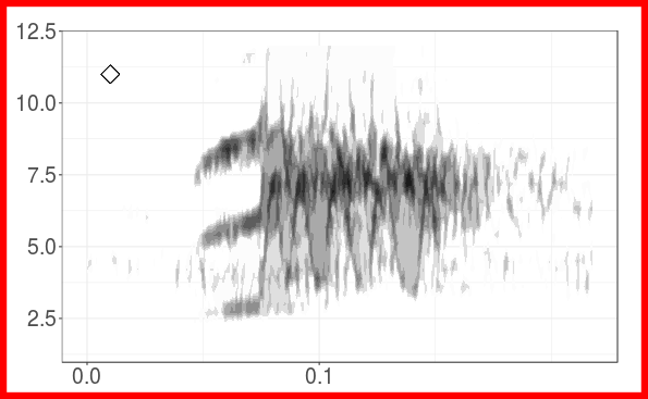
##
## [[4]]
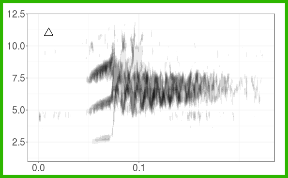
##
## [[5]]
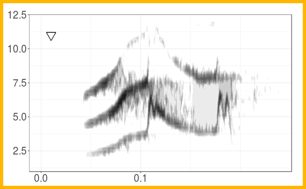
##
## [[6]]
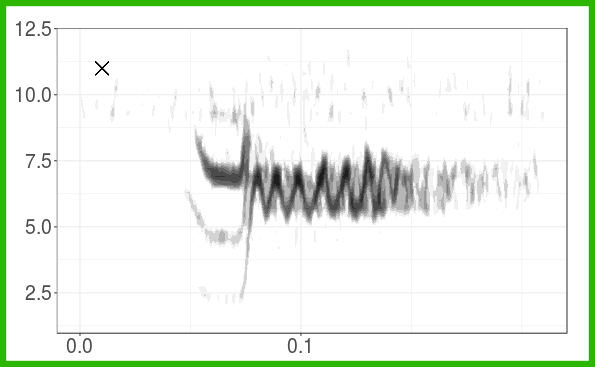
# choosing first song per recording
X <- Phae.hisnr[!duplicated(Phae.hisnr$sound.files), ]
X$cols <- lbhMDS$cols[!duplicated(Phae.hisnr$sound.files)]


# creating spectrograms with colored borders by cluster
plot_list <- lapply(1:nrow(X), function(i) {

 spc <- ggspectro(tuneR::readWave(file.path(tempdir(), as.character(X$sound.files[i])),
        from = X$start[i] - 0.05, to = X$end[i] + 0.05, units = "seconds"), f = 22050,
                  wl = 150, ovlp = 90, palette = reverse.gray.colors.2,
                   collab = "black", flim = c(1.5, 12), tlab = "",
                   flab = "", alab = "", scale = FALSE, grid = FALSE,
                   cexlab = 1.5, trel = FALSE) +
    stat_contour(geom = "polygon", aes(fill=..level..), bins = 30) +
    scale_fill_continuous(name = "Amplitude (dB)", limits = c(-30,0),
        na.value = "transparent", low = "white", high = "black") +
    theme_bw() +
    guides(color = FALSE, fill = FALSE) +
    ggtitle(unique(X$rid)[i]) +
    theme(axis.title.x = element_blank(), axis.title.y = element_blank(),
          axis.text.x = element_text(size = 20), axis.text.y = element_text(size = 20),
          axis.line.x = element_line(size = 20), axis.line.y = element_line(size = 20),
          plot.margin = unit(c(2,2,1,1), "lines"),
          plot.title = element_text(size = 24, vjust = 1, face = "bold")) +
    scale_x_continuous(breaks = c(seq(0,  X$end[i] - X$start[i], 0.1))) +
      theme(plot.background = element_rect(size = 6, linetype = "solid",
                                           color = X$cols[i])) +
     annotation_custom(
      grob = pointsGrob(pch = shps[i], gp = gpar(cex = 1.5)),
      ymin = 11,  ymax = 11,  xmin = 0.01, xmax = 0.01)

  return(spc)
  })

plot_list
Put all the grobs (graphical objects) together:
#create grobs and initialize some viewport settings

col.leg <- gtable_filter(ggplot_gtable(ggplot_build(col.leg)), "guide-box")
shape.leg <- gtable_filter(ggplot_gtable(ggplot_build(shape.leg)), "guide-box")


# each component of the figure is a grob or graphical object that can be placed in a viewport
grobs <- list(ggplotGrob(p.mds), col.leg, shape.leg,
              ggplotGrob(plot_list[[2]]),
              ggplotGrob(plot_list[[4]]),
              ggplotGrob(plot_list[[3]]),
              ggplotGrob(plot_list[[1]]),
              ggplotGrob(plot_list[[6]]),
              ggplotGrob(plot_list[[5]]))

sw <- 0.46
sh <- 0.28

buf <- 0.05
sx <- c(0.15-buf, 0.15+ sw)
sy <- c(0.32, 0.62, 0.92)

sxs <- unit.c(unit(sx, "npc"))
sys <- unit.c(unit(sy, "npc"))

sheight <- unit.c(unit(sh, "npc"))
swidth <- unit.c(unit(sw, "npc"))

# the overarching tree has a list of viewports with some stacked on top of each other
# this layout allows for more complex arrangements when creating figures
# but tends to work best when if most of grobs are of similar and regular sizes
tree <- vpTree(viewport(w=1, h=1, name="A"),
               vpList(viewport(x=0, y = 0.45, w=0.5, h=0.95-buf,
                               just="left", name="B"),
                      viewport(x=0.5, y = 0.92, w=0.3, h=buf,
                               just="center", name="C", angle = 0),
                      viewport(x=0.5, y = 0.97, w=0.3, h=buf,
                               just="center", name="D", angle = 0),
                      vpStack(viewport(x = 0.5, y = 0.95, w = 0.45, h = 0.9,
                                       just=c("left", "top"), name="E"),
                              vpList(viewport(x = sxs[1], y = sys[1], w = swidth,
                                              h = sheight,
                                                  just=c("left", "top"), name="F"),
                                         viewport(x = sxs[1], y = sys[2], w = swidth,
                                                  h = sheight,
                                                  just=c("left", "top"), name="G"),
                                         viewport(x = sxs[1], y = sys[3], w = swidth,
                                                  h = sheight,
                                                  just=c("left", "top"), name="H"),
                                         viewport(x = sxs[2], y = sys[1], w = swidth,
                                                  h = sheight,
                                                  just=c("left", "top"), name="I"),
                                         viewport(x = sxs[2], y = sys[2], w = swidth,
                                                  h = sheight,
                                                  just=c("left", "top"), name="J"),
                                         viewport(x = sxs[2], y = sys[3], w = swidth,
                                                  h = sheight,
                                                  just=c("left", "top"), name="K")))))


grid.newpage()
pushViewport(tree)

vps <- LETTERS[c(2:4, 6:11)]
for(i in 1:length(vps)) {

    seekViewport(vps[i])

    grid.draw(grobs[[i]])
}

# draw x and y axes for all spectrograms
seekViewport("E")
grid.draw(linesGrob(x = unit(0.05, "npc"), y = c(0, 0.93),
          gp=gpar(lwd = 8)))
grid.draw(linesGrob(x = c(0.05, 1.05), y = unit(0, "npc"),
                    gp=gpar(lwd = 8)))
grid.text("Time (s)", x = 0.5, y = -0.025, rot = 0, gp = gpar(cex = 2.5))
grid.text("Frequency (kHz)", x = 0, y = 0.5, rot = 90, gp = gpar(cex = 2.5))
That’s it!