Somehow measuring a bunch of spectral/temporal parameters and then reducing its dimensionality using principal component analysis has become the standard procedure when looking at variation in signal structure (i.e. measuring acoustic space), particularly in behavioral ecology and comparative bioacoustics. In most cases the approach is used without any kind of ground-truthing that can help validate the analysis. Given the complexity of animal acoustic signals, the approach could miss key signal features. Here I share a quick-and-dirty comparison of this ‘standard approach’ to a potentially better suited alternative.
But first load/install warbleR, set warbleR options and create a fancy color palette for catalogs:
# vector with packages needed
w <- c("Rtsne", "githubinstall", "mclust", "RColorBrewer")

# load/install each with a loop
for(i in w)
if (!require((i), character.only = TRUE)) install.packages(i)

# install/load warbleR from github (remove it first if already installed)
githubinstall("warbleR", ask = FALSE, force = TRUE)

library(warbleR)

# set warbleR options
warbleR_options(bp =  c(2, 10), flim = c(3.5, 10.5), pb = FALSE, wl = 200,
                ovlp = 90, parallel = 3, pal = reverse.heat.colors)

# create nice color pallete
cmc <- function(n) rep(adjustcolor(brewer.pal(5, "Spectral"),
                                   alpha.f = 0.6),
                       ceiling(n/4))[1:n]
As in the previous post, we will run the comparison on signals detected on a recording from a male Striped-throated Hermit (Phaethornis striigularis) from Xeno-Canto. We can download the sound file and convert it into wave format as follows:
# set temporary working directory
 setwd(tempdir())

# Query and download  Xeno-Canto for metadata using genus
# and species as keywords
Phae.stri <- quer_xc(qword = "nr:154074", download = TRUE)

# Convert mp3 to wav format
# Simultaneously lower sampling rate to speed up down stream analyses
mp32wav(samp.rate = 22.05)
A long spectrogram would help to get a sense of the song structure in this species:
lspec(ovlp = 50, sxrow = 3, rows = 12)
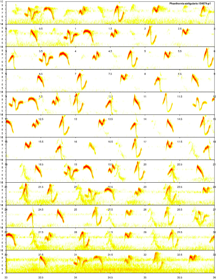
We can also listen to it from Xeno-Canto. The elements of this song are pure tone, highly modulated sounds that are recycled along the sequence. Overall, the structure of the element types seems to be consistent across renditions and the background noise level of the recording looks fine.
To run any analysis we need to detect the time ‘coordinates’ of the signals in the sound file using auto_detec:
ad <- auto_detec(wl = 200, threshold = 3.5, ssmooth = 1200,
                 bp = c(4, 9.6), mindur = 0.1,
                 maxdur = 0.25, img = FALSE)
Lets’ select the 100 highest signal-to-noise ratio signals, just for the sake of the example:
# measure SNR
snr <- sig2noise(ad, mar = 0.05, type = 3)

# selec the 100 highest SNR
ad <- snr[rank(-snr$SNR) <= 100, ]
… and measure the frequency range (as in the previous post):
fr_ad <- freq_range(X = ad, bp = c(2, 12), fsmooth = 0.001,
                    ovlp = 95, wl = 200, threshold = 10,
                    img = FALSE, impute = TRUE)
Finally, let’s pack the acoustic data and metadata together as a ’extended_selection_table’ (check this vignette section to learn more about these objects):
est <- selection_table(X = fr_ad, extended = TRUE,
                       confirm.extended = FALSE)
We can take a look at the selected signals (or elements, subunits or whatever you want to call them) by creating a catalog:
catalog(est, nrow = 10, ncol = 10, mar = 0.01, labels = "selec",
        flim = c(3.5, 10.5), ovlp = 30, pal = reverse.heat.colors,
        width = 15, box = FALSE, spec.mar = 0.5,
        max.group.cols = 4, tag.pal = list(cmc), cex = 2, rm.axes = TRUE)
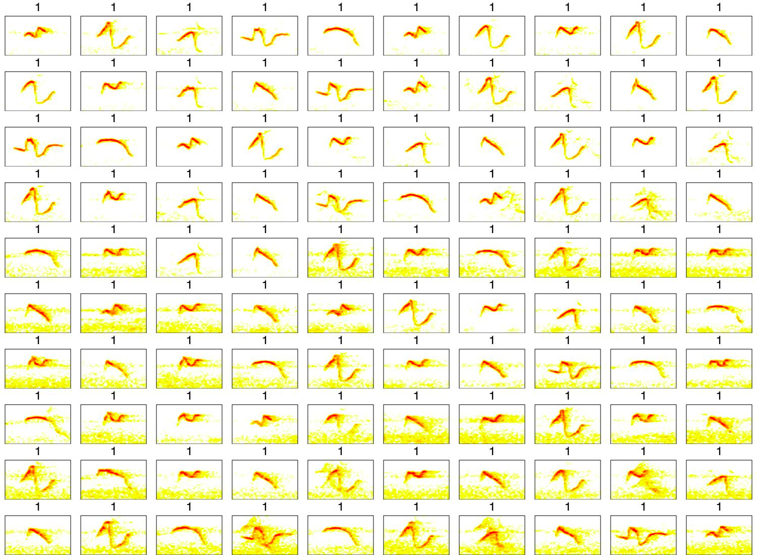
Some are too noisy, but still good enough for the example.
Element classification using the ‘standard’ approach
So let’s use the spectro-temporal parameters + PCA recipe. First acoustic parameters are measured using spec_an and then a PCA is run over those parameters:
sp <- spec_an(X = est)

pca <- prcomp(sp[ , -c(1,2)], scale. = TRUE)

pca_sp <- summary(pca)

barplot(pca_sp$importance[3, 1:10], col = rev(.Options$warbleR$pal(10)),
        ylab = "Cumulative variance explained", xlab = "PCs",
        ylim = c(0, 1))

abline(h = 0.8, lty = 2)
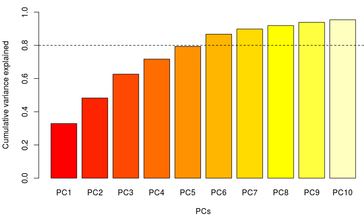
The first 5 components explain almost %80 of the variance.
Now let’s look and how good is the classification of elements based on the first 5 PCs. To do this we can use the Mclust function from the mclust package to choose the most likely number of clusters and assign each element to one of those clusters:
# run mclust
sp_clust <- Mclust(as.matrix(pca_sp$x[, 1:5]), G=1:15,
                   modelNames = mclust.options("emModelNames"),
                   verbose = FALSE)

# add cluster label to each element (row)
est$class.sp <- as.character(sp_clust$classification)

# add a 0 to each value so they are displayed in order
est$class.sp <- ifelse(nchar(est$class.sp) == 1,
                             paste0(0, est$class.sp), est$class.sp)
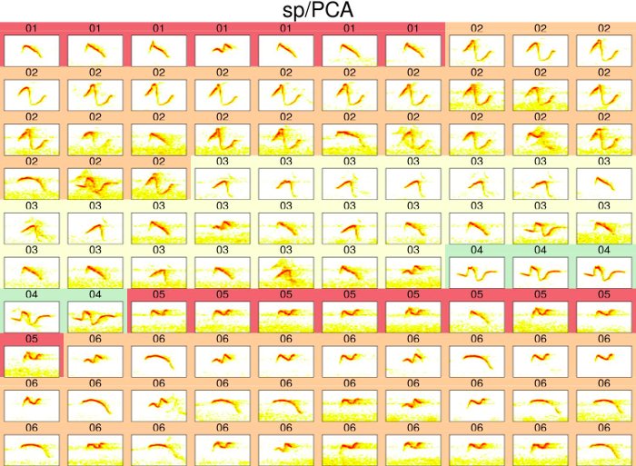
The classification can be visually assessed using a ‘group-tagged’ catalog. In the catalog, elements belonging to the same cluster are located next to each other. Elements are also labeled with the cluster number and colors highlight groups of elements from the same clusters (note that colors are recycled):
catalog(est, nrow = 10, ncol =10, mar = 0.01,
        flim = c(3.5, 10.5), ovlp = 30, labels = "class.sp",
        group.tag = "class.sp", pal = reverse.heat.colors,
        width = 15, box = FALSE, spec.mar = 0.5,
        title = "sp/PCA", img.suffix = "sp-PCA", max.group.cols = 4,
        tag.pal = list(cmc), cex = 2, rm.axes = TRUE)
A better way to look at this is by plotting the first 2 PC’s:
plot(pca_sp$x[, 1], pca_sp$x[, 2], col = as.numeric(est$class.sp),
     pch = as.numeric(est$class.sp), cex = 1.5, xlab = "PC1",
     ylab = "PC2")
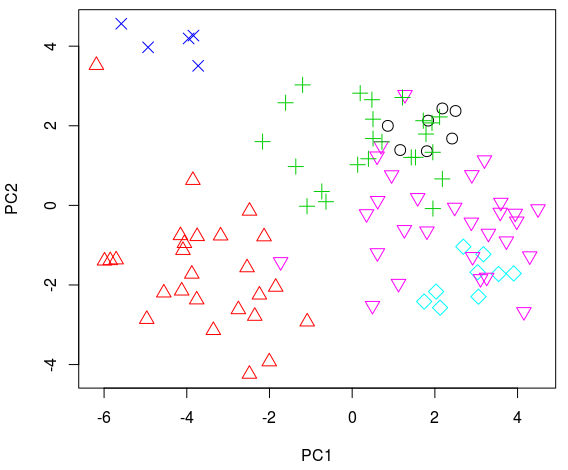
Most clusters include several different element types and the same element type can be found on several categories. In this example the performance of the ‘standard approach’ is not ideal.
An alternative
When working with pure tone modulated whistles, the best approach is likely measuring dynamic time warping distances on dominant frequency contours. We can do all that at once using df_DTW:
df <- df_DTW(X = est, wl = 200, threshold = 15, img = FALSE,
             clip.edges = TRUE, bp =  c(2, 10))
To convert this distance matrix to a rectangular data frame we can use TSNE. The name stands for T-distributed Stochastic Neighbor Embedding and is regarded as a more powerful way to find data structure than PCA (and yes, it can also be applied to non-distance matrices). The method can be easily run in R using the Rtsne function from the package of the same name. The following code does the clustering and cataloging as we did above:
# set seed so we all get the same results
set.seed(10)

# run TSNE
tsne.df <- Rtsne(X = as.dist(df), theta = 0.01, dims = 5,
                 is_distance = TRUE)

# clustering
df_clust <- Mclust(as.matrix(tsne.df$Y), G=1:15,
              modelNames = mclust.options("emModelNames"),
              verbose = FALSE)

# label elements (rows)
est$class.df <- as.character(df_clust$classification)
est$class.df <- ifelse(nchar(est$class.df) == 1,  paste0(0, est$class.df),
                       est$class.df)

# make catalog
catalog(est, nrow = 10, ncol = 10, mar = 0.01,
        flim = c(3.5, 10.5), ovlp = 30, labels = "class.df",
        group.tag = "class.df", pal = reverse.heat.colors,
        width = 15, box = FALSE, spec.mar = 0.5,
        title = "df_DTW/TSNE", img.suffix = "df_DTW-TSNE",
        max.group.cols = 4, tag.pal = list(cmc),
        cex = 2, rm.axes = TRUE)
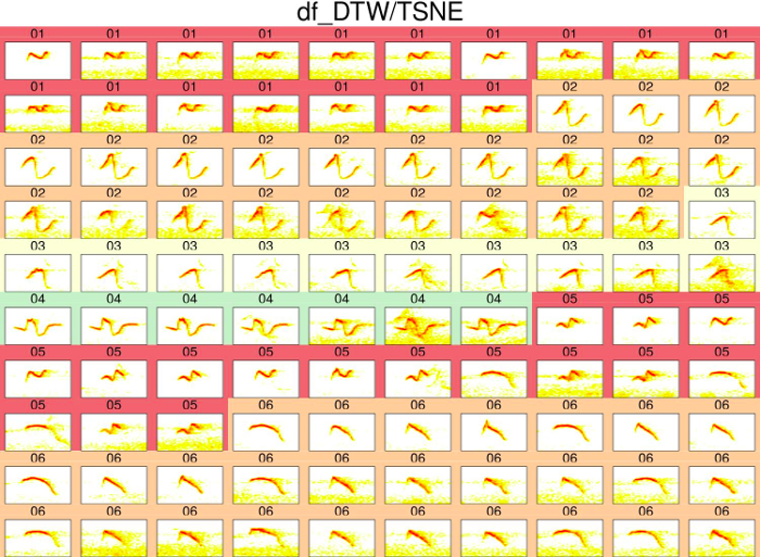
We can obtain 2 dimensions using TSNE so it fits better in a bi-dimensional plot (grouping is likely to improve when adding more dimensions, so this plot gives a conservative estimate):
# set seed so we all get the same results
set.seed(10)

tsne.df <- Rtsne(X = as.dist(df), theta = 0.01, dims = 2,
                 is_distance = TRUE)

plot(tsne.df$Y[, 1], tsne.df$Y[, 2], col = as.numeric(est$class.df),
     pch = as.numeric(est$class.df) + 5, cex = 1.5, xlab = "Dim 1",
     ylab = "Dim 2")
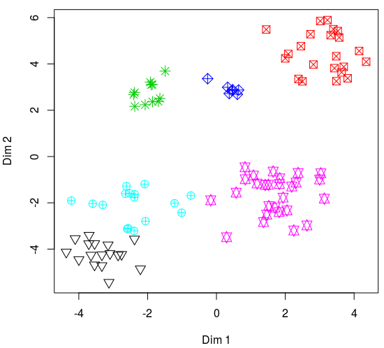
The classification seems OK. Most clusters contain a single element type, and most types are found in a single cluster. Nonetheless, the classification was not perfect. For instance, clusters 5 and 6 share some element types. However, it’s much better compared to the ‘standard approach’. In a more formal analysis I will make sure the frequency contours are tracking the signals (using sel_tailor()). This will likely improve the analysis.
This quick-and-dirty comparison suggests that we (behavioral ecologists) might actually be missing important signal features when using the spectral/temporal parameters + PCA recipe as the silver bullet in bioacoustic analysis. It also stresses the importance of validating our analyses in some way. Otherwise, there is no way to tell whether the results are simply an artifact of our measuring tools, particularly when no differences are found.